Moving the brand goalposts
Given the task of assigning a sport to the US, one could be forgiven for immediately thinking of baseball, basketball, or even American football. All are huge entertainment spectacles involving heady amounts of sponsorship and investment; all continue to result in the creation of global superstars.
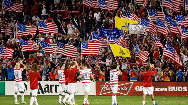
Yet soccer, as it is known in the US, lacks the big-name stars and clubs which have become almost ubiquitous across European, South American and African football culture. Major television networks are also less likely to show it – in some cases, it is simply not considered exciting enough.
However, as time goes on, appreciation of soccer in the US is becoming increasingly more widespread. Many factors are behind this, not least the ever-increasing investment in youth participation schemes and a gender divide which is infinitely smaller than anything currently experienced at even the UK amateur level.
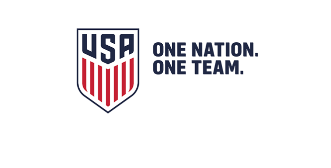
Considering this uplift, it seems therefore fitting that the US Soccer Federation, in partnership with Nike, should choose 2016 to undergo its rebrand. This is the first update to its crest since 1995 - two years after plans to update its identity began.
While the red, white and blue of the crest remains the same, reflecting the patriotism and passion behind this ever-popular sport and its country, the whole design has been simplified. The football icon that before fitted in the intersection between ‘U’ and ‘S’ has been forgone in favour of the 'USA' lettering, and the crest shape is clearer and more defined.
Blue initials now constitute lettering on the crest, with 13 white and red stripes laid vertically underneath. This font, specifically designed for the US Soccer Federation by typeface designer Tal Leming, is named 90Minutes.
Inclusion of stars above a team crest is generally taken to indicate how many world cups have been won by the corresponding team - a trend started by the Brazilian national team in 1970. Considering the US men’s team has never won a world cup, its original three stars will be absent from the jersey.
The US women’s national team will feature three stars to signify wins in 1991, 1999 and 2015 respectively.
The US Soccer Federation was also innovative in its promotional tactics, employing guerrilla marketing to spread word of the new design. With 10,000 packages posted to a plethora of its members and associates, Google Cardboard was used to provide a 360-degree perspective into both the men’s and women’s national team, as well as narration from former, current and future soccer stars.
Application of this virtual and augmented reality system allowed fans to get closer to the sport than ever before - exactly what the US Soccer Federation is attempting to achieve through its rebrand.


