Hashtag new filter
Photography is an integral part of social media platforms, with pictures of events and occasions being shared on Facebook almost since its inception.
Although sharing photographs used to be a secondary function of the site, pictures have become a main method of communication for some users. In line with demand, Instagram, launched in 2010 as a mobile app, was created to equip users with the ability to take, edit and share photos of a quality previously achievable only with a high-resolution DLR camera.
Developed by Kevin Systrom and Mike Krieger, Instagram allows users to share photos either publicly or privately, apply filters to enhance the image aesthetics, and upload 15 second videos.
During its first few years, a characteristic feature of Instagram was allowing users to only take pictures in a square shape, in a design quirk developed to reflect a historic Polaroid camera. The name itself is a portmanteau of ‘instant camera’ and ‘telegram’.
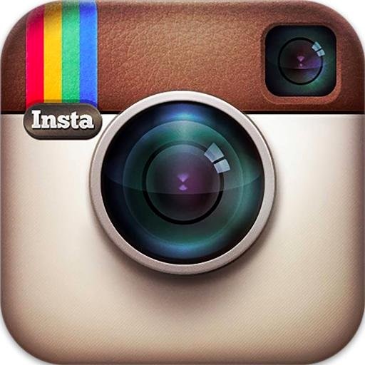
Following in this vein, the brown and cream app icon used since 2010 was a version of a Polaroid camera. Today, however, Instagram has rolled out a new brand icon design, implemented by an in-house team, in a bid to reflect the multitude of new ways the site is being used.
In a move which aims to retain the current associations of Instagram but lend the brand more character, its well-loved rendered camera has been simplified down, resembling a glyph more than its iconic Polaroid design. Using a yellow to purple gradient as its main colour scheme, its ‘family of icons’ including functions such as Boomerang will also adopt the new design.
In a blog post, Instagram says, “The Instagram community has evolved over the past five years from a place to share filtered photos to so much more — a global community of interests sharing more than 80 million photos and videos every day. Our updated look reflects how vibrant and diverse your storytelling has become.”
Instagram has also redesigned the menus and background of its user interface, although it will still work in the same way. Eschewing its characteristic soft blue, the company has implemented a design which puts the user’s photo, and the photos of their followers, at the heart of brand experience.
For some critics, an element of the previous app logo cited as particularly difficult to part with is the intricate light detail on the camera lens design.
While there is no doubt the new iteration lends itself well to an age of increasingly high-resolution smart phones and sleek app imagery, nostalgia may play a role in preventing legions of Instagram fans from carefree adoption of the logo.
Yet, with so many users on the app daily, it seems certain that within a few months, the new Instagram brand will be as engrained into consumer consciousness as its previous iteration.


