Driving the future of typography
Typeface is ubiquitous, an integral component of every brand. Where a brand image communicates the theme of a company, lending a visual identity to its products, it is typeface that determines the brand’s sophistication.
Hence typography has become an integral factor when distinguishing between similar products created by a variety of different corporations – the car market is one of the best examples of this.
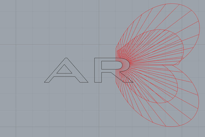
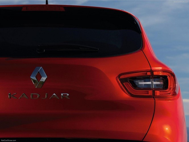
Renault, a global leader in car manufacturing, have revealed a new typeface for its fleet of new cars. Designed to ensure visibility even when the car is in motion, the Renault car design team enlisted Paris-based design studio Production Type to create a ‘suite of fonts’ applicable to the entire family of Renault vehicles.
Established in 1898, Renault’s new typeface design takes cue from its varied and innovative past while considering its application to a new generation of motoring. With this in mind, it is minimalist yet functional – the Renault Carname, as the font variations have been dubbed, were created with the intention of beginning a new era of automobile visual expression.
Renault’s new approach to typography is reflected in the attention to detail given to the alphabet, where each letter is designed to successfully correspond with the new 3D visuals. This marks a fairly dramatic shift from the more industrial, 2D font which for so long characterised Renault cars.
Jean-Baptiste Levée, Production Type’s president and lead designer on the project, says, “Chrome letters have their own peculiar way of behaving, and must be treated as such.”
“Receiving and reflecting light elegantly is one of the key roles a chrome letter is expected to play: their shapes need to interact closely with the environment, their lines and curves must perform seamlessly with sun rays. Among the multiplicity of parameters, our team sought the most down-to-earth (matching a minimum typeface weight to the viscosity of a glue) and the most person-oriented (thickening and rounding small stems & spikes which can be hazardous in case of an impact).”
Brand typeface is generally taken for granted by the everyday consumer; yet is generally the first thing noticed when a well-known brand changes design. Renault are taking advantage of a move away from its established brand font, in doing so cementing its commitment to car manufacturing innovation.


