Cleared for takeoff

International brand agency Base Design teamed up with JFK's Terminal 4 in New York to create a new logo and visual identity consisting of vibrant, fun signage that directs travellers throughout the terminal.
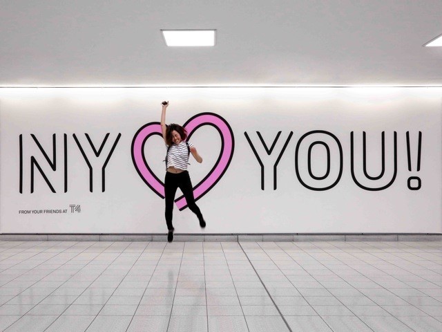
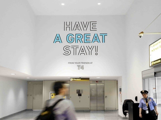
The terminal wanted to change the passenger experience from the confusion and apprehension that often comes with travelling into a more relaxed, refreshing experience.
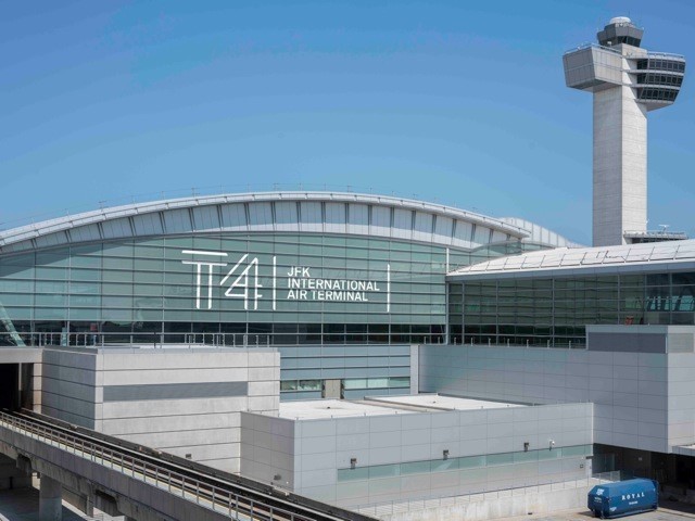
Terminal 4 at John F. Kennedy International Airport (JFK) is one of the world’s busiest terminals with an annual passenger volume of 19.5m travellers. It is the only privately owned terminal in North America, managed by JFKIAT – and is one of the largest terminals at 165 acres, housing 32 international and domestic airlines.
Since its opening in May 2001, the terminal has seen an exponential increase in travellers. The terminal quickly became outdated, as it was unable to handle passenger traffic.
To overcome the congestion, an expansion plan was put in place, completed in 2015. The terminal is now home to brand new restaurants, upgraded bars, and a bigger variety of food options. Its extensive shopping mall offers a variety of retail options including upscale boutiques convenience stores, electronics and gifts.
To complement this expansion, Terminal 4 has rebranded to keep up with the airline industry’s increasing focus on seamless, comfortable passenger experience.
According to Min Lew, partner and creative director at Base Design, the rebrand considers the people going through the airport and breaks away from the tired trend of centring airport design around airplanes and efficiency.
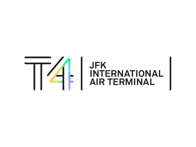
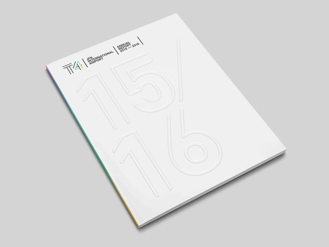
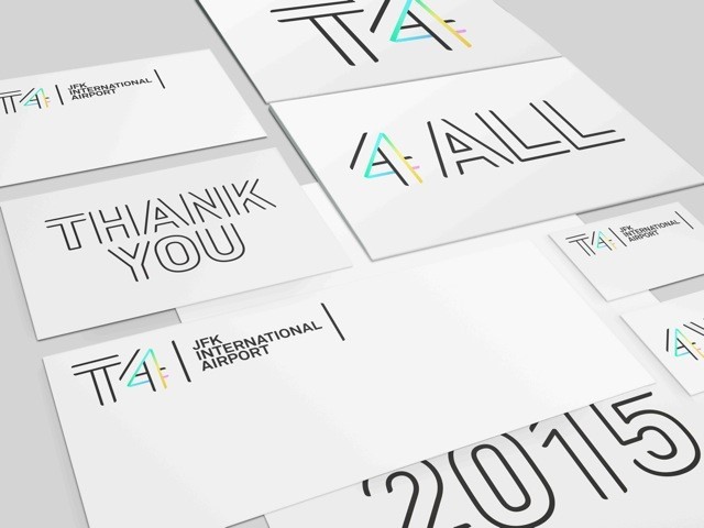
Focusing on the number 4, the rebrand consists of a custom typeface and vibrant palette, personifying the terminal experience for travellers.
Its multiline monogram, based on the Terminal 4 exterior grid, wraps around itself to create an illusion of spacious pathways. The ends of the typeface are left open and unbounded, giving the text an airy, unconstrained appearance.
Visually, this is intended to give passengers a feeling of lightness and ease as they pass through the terminal.
Its vibrant palette is used sparingly, with colors running through the custom typeface to create a simple yet elegant design without being overwhelming. On print, a single neon line of pastel colors runs through the typeface of the number 4, giving the logo a sense of freshness while maintaining a professional appearance.
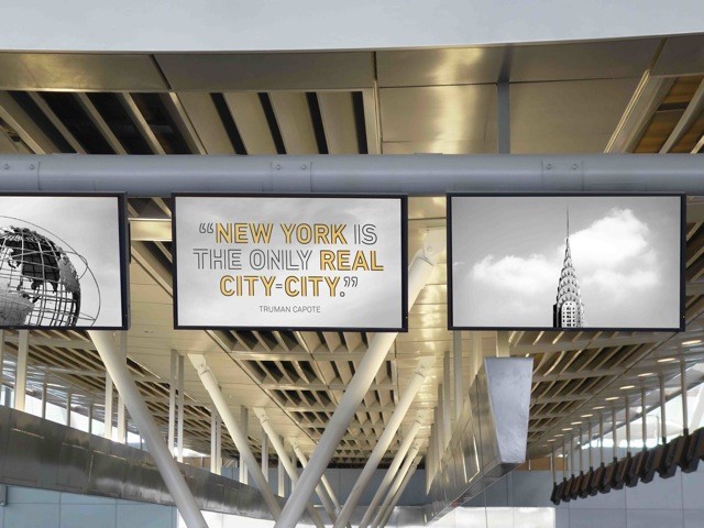
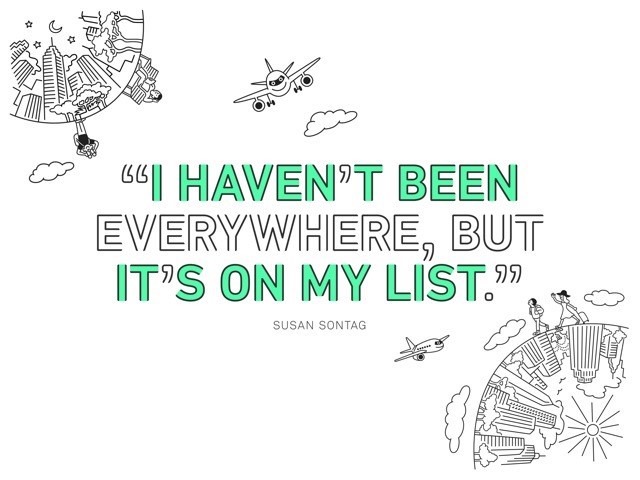
The creative applications, to be rolled out over the course of the year, include signage, informative trivia, quotes, and fun illustrations by Tomi Um. It will also include products such as T4 branded T-shirts, stationery, mugs and travel pillows. Fun and playful, yet serious at the same time, this rebrand shapes Terminal 4’s identity as a pleasant breath of fresh air, something usually not associated with airport terminals.


