A league of its own

Football is inarguably the biggest sport in the UK. Rainy Sunday leagues often dominate childhood, football is a major topic of conversation during social occasions and unwavering support for chosen teams can cause the most heated of arguments.
For those football fans who grew up in the UK, these defining moments are underpinned by the iconic football league – headed up by the Barclays Premier League.
The Premier League is the harbinger of world famous football clubs, the purveyor of immense sums of money, and the creator of big-name stars. Harnessing the support of football fans across the world, the league surpassed its identity to become an iconic brand.
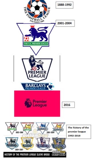
Yet this visual identity, name and logo has undergone the biggest rebrand since 2007-08, when it changed name to the Barclay’s Premier League – prior to this, it had been known as the Barclaycard Premiership. Now forgoing the Barclay’s brand, football fans will simply talk of the ‘Premier League’ – and its several newly-associated colours.
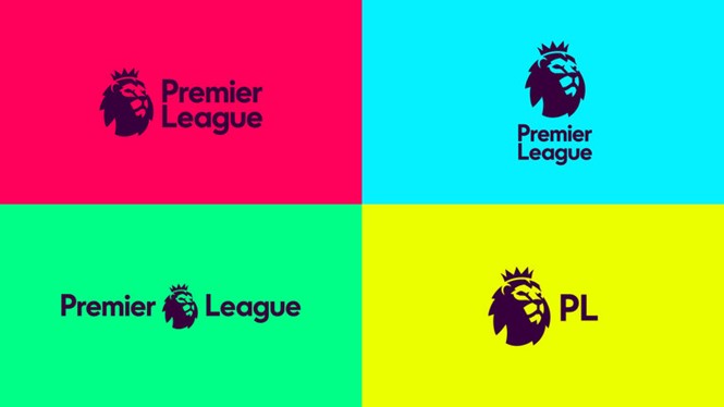
DesignStudio, collaborating with Robin Brand Consultants, have simplified the design and updated its colour palette away from the blue tones picked out by the red ball. The iconic lion, astride the brand name, has been simplified to become just a head. As the new branding will not be sponsored, the design instead relies on such heritage aspects to ensure the logo remains appealing to fans and investors.
Also different is the original Premier League typeface, which now aims to move away from the utilitarian concept surrounding the previous design. Its rounded sans font is more informal than its predecessor, yet corresponds with the brighter imagery to unify the new design well.
The end result aims to be modern, purposeful and friendly. Its utility as an app design drove the rebrand from its initial stages and became a major factor in its overall look, bringing the brand into the digital era – as well as ensuring it remained suitable for broadcast.
Ian Paget, lead creative designer at website design company Advansys, says, "The use of logo design has evolved rapidly over the past few years, with our most common interaction with a company's identity being social media and mobile devices where the icon is only a few millimetres wide. The change to the Premier League logo is very clearly influenced by this shift in how people are engaging with the brand, creating a new lion mark that’s instantly recognisable on all platforms, at all sizes. The lion is full of attitude, bold and brave - however I do feel the supporting type treatment lacks the same sense of character and uniqueness."
"The previous identity was very authoritative and established, using the typical style expected from a sports brand, while the new identity throws that to one side, now feeling younger and more personal. It’s a dramatic change that I’m sure will have a massive impact on the future sports branding."