A domino effect
Boxes of popcorn at the cinema, ‘sharing’ bags of crisps passed around the office, luxurious meals such as cheese or chocolate fondue – all are made as a treat to share between more than one person.
Pizza, however, is perhaps the quintessential sharing food. With an easily tearable texture, a huge variety in the of toppings and its association with a relaxed night in, pizza has become the ideal food choice for a night with a group of friends.
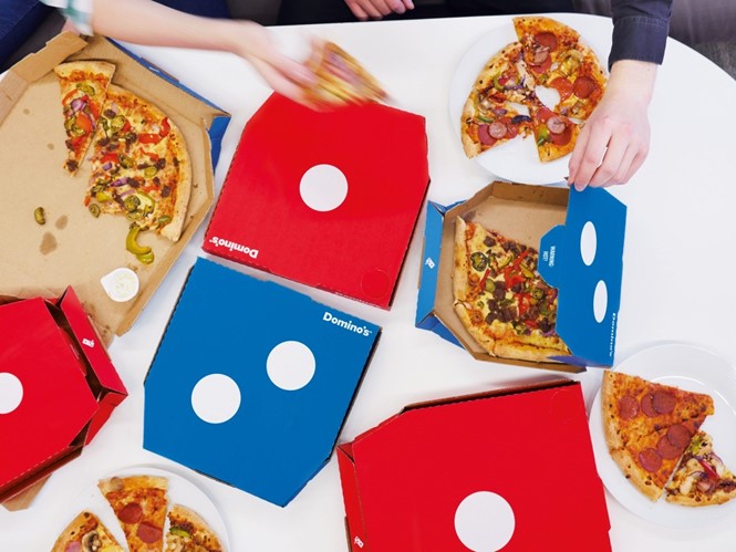
With this in mind, London-based creative agency jones knowles ritchie (JKR) has developed a new packaging concept for UK pizza chain Dominos. Putting the concept of sharing at the heart of its design, its new boxes focus on the popularity of the Dominos brand as an option to share between groups of people – its various two for one and multi-buy savings offers generate 96% of its UK sales.
JKR’s box design eschews the artisanal, localised concept of the previous designs, which were a highly decorated version of the traditional brown pizza box and changed according to the locality of the Dominos branch.
Lee Rolston, gobal strategy director at JKR, says in a press release, “Domino’s is the biggest pizza chain in the world, but after decades of local market interpretations of the pack design, its boxes had become cluttered with generic messaging and the brand mark had a small presence on its boxes.”
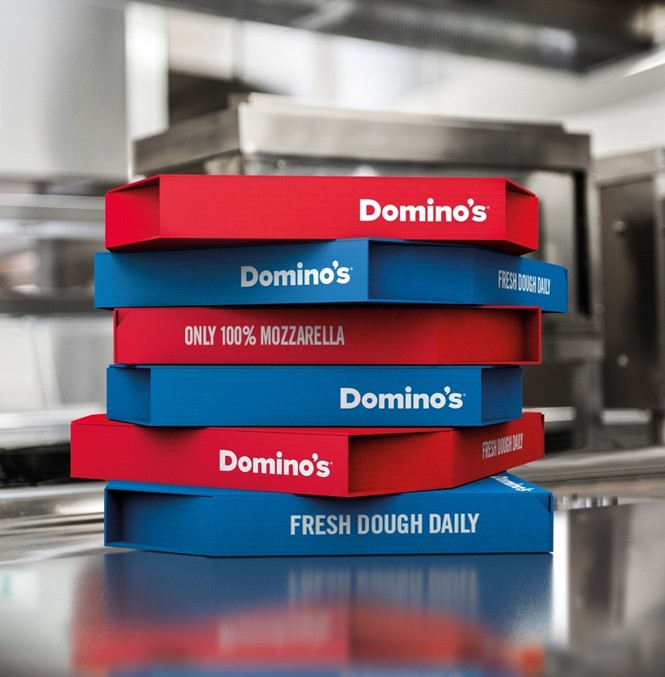
The variety of illustrations and imagery, which adorned the box lid, has been replaced with bold, bright colours. There is also a clear and dramatic removal of all text from the lids, which has been replaced with only simple information regarding the contents of the pizza, to go on the white sides of the box.
Sean Thomas, creative director at JKR, says, “Our creative goal was to reinforce the brand’s distinctiveness and make people feel proud about choosing Domino’s over a competitor pizza.”
“The Domino’s logo is both charismatic and memorable, and we saw the perfect opportunity to translate this directly to the pack and make it a tangible expression of people coming together over pizza. The design makes an instant impact on the doorstep and means that consumers aren't just ordering a pizza, they are ordering a Domino’s.”
As well as accentuating the sharing concept, JKR’s new packaging design also focuses heavily on the Dominos’ name.
Taking its cue from the popularity of the dominoes game in the UK, the boxes have been created to resemble a dominoes playing piece, with striking red and blue opposite ends and the numerical dominoes design adorned in white.
JKR has also ensured the brand logo gets a more obvious presence. The Dominos name is now a main feature of its visual identity, with the white text standing out more clearly on the primary colour background.


