#TransformTuesday: 22 September
Every week, Transform examines recent rebrands and updated visual identities. This week's picks are below. For more from #TransformTuesday, follow @Transformsays
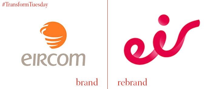
Eircom rebrand to Eir
In what Eir describes as the largest rebranding in Ireland for 20 years, 100 external agencies were employed to bring Eir’s new, moving logo to life. Eircom invested around €16m into the rebrand, overhauling the image to modernise the look and feel of the telecommunications group. So far, nine Eircom stores have been fully refitted, with a further 63 adjusted to suit the rebrand overhaul. This is not the company’s first rebrand, however. Back in 1999, Telecomm Éireann became Eircomm, shifting from a state-owned asset to a privatised telecommunications company.
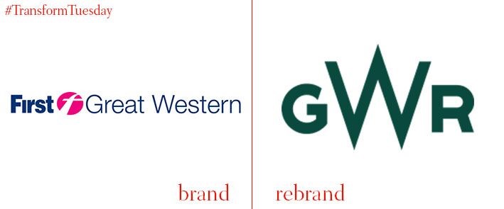
First Great Western rebrands back to Great Western Railways
In a move which sees FGW attempt to claim back their historical image, Great Western Railways recalls the original name and spirit of the service, which began running in 1833. The original railway, which linked Bristol to London for the first time, was created by the famous English engineer, Isambard Kingdom Brunel. Three Great Western Railway trains have been repainted in a dark green to represent this link with heritage, although it is expected that the repainting of the entire fleet will not be completed until 2018.
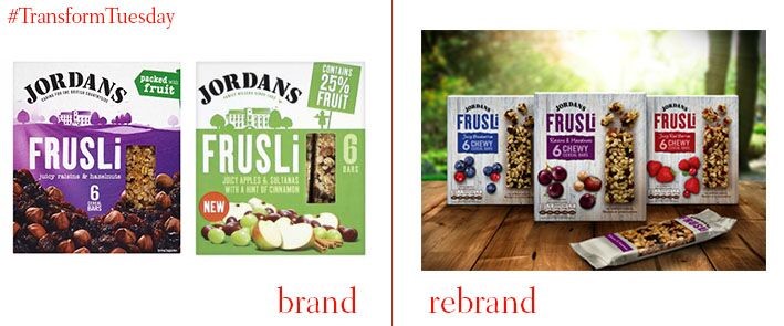
New design for FRUSLi bars
Completed by external strategic branding company Coley Porter Bell, the new design for FRUSLi bars has a heavy focus on simplicity. The bars were first launched in 1985, setting a precedent for the insatiable variety of breakfast bars seen on supermarket shelves today. Indeed a contemporary consumer shift towards natural living and eating is what spurred the rebrand, with its focus on simplicity responding to the consumer desire for a more natural edible product.
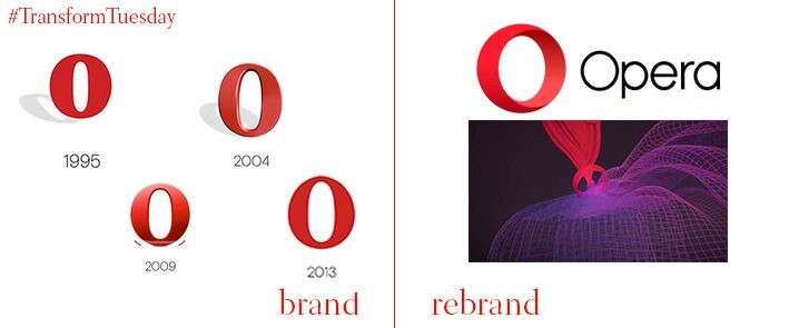
Opera Software rebrand to Opera
Twenty years ago Opera Software was launched as a browser vendor. However, its new rebrand sees Opera moving to be recognised as a purely online search-based internet firm, with its wide range of consumer products extending to data savings, discoveries and communication. As such it has dropped the ‘software’ from its logo, and its subsidiary business Opera Mediaworks is also in the pipeline for a new image. Opera have retained the familiar red O, however, which in its new image is intended to symbolise a gateway for consumers to an accessible online environment.
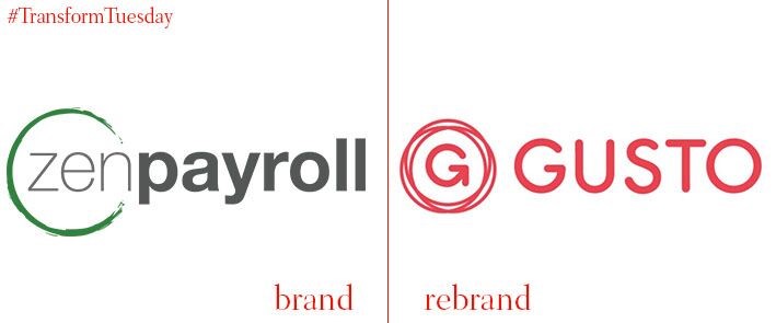
ZenPayroll rebrands as Gusto
San Francisco-based accounting software company ZenPayroll have changed their name to Gusto, with a new logo and brand image to reflect this. Cited by the company as a name which is inspired by the enthusiasm and appreciation its employees and customers show, the image change will better reflect the direction and missions of the company. Josh Reeves, CEO and co-founder of Gusto, says, “We’ve transformed traditionally impersonal tools for employee onboarding, payroll, and health insurance into a service that connects companies with their teams in a more human way.”