#TransformTuesday: 15 September
Every week, Transform examines recent rebrands and updated visual identities. This week's picks are below. For more from #TransformTuesday, follow @Transformsays
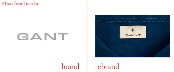
Gant
Gant has unveiled a new take on their established logo. Reviving lettering found on a traditional Gant factory frontage, it employs extended sans serif text to counter perceptions of the Gant brand as suited to an ageing customer base. Sweden-based Essen International, the independent design firm behind the new logo, say they are “shifting the core of the brand from recreational coastal living to sophisticated cosmopolitan living”.
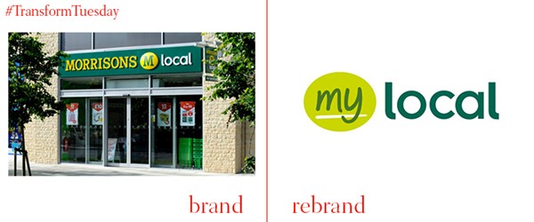
Morrisons M Local to My Local
There were 140 convenience stores originally branded as M Local under the ownership of the supermarket chain Morrisons, which will be rebranded to become My Local. The stores were sold last week to investment firm Greybull Capital for £25mn and retail businessman Mike Greene. Visually the logo is fairly similar, indicating a minimal shift from the format originally trialled by Morrisons.
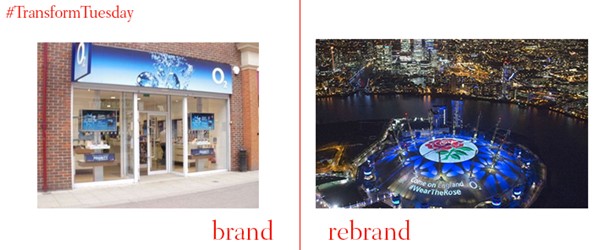
O2
The ‘O’ of the O2 logo has been temporarily replaced by a red rose across 377 of the company’s store fronts. Aimed towards encouraging the UK public to get behind the England team during the Rugby World Cup, which begins of 18 September, the rose logo was created by an in-house design team. O2 has a legacy with the England rugby team, having sponsored them since 2002. Other marketing techniques such as social media and digital billboards are intended to encourage interaction from the O2 branding and generate further support for England.
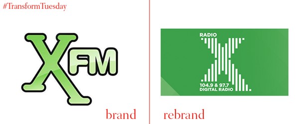
Radio X rebranded from Xfm
It was announced last week that the radio station XFM is being rebranded by its owner Global to become Radio X, taking effect from 21 September. In a perhaps controversial move, its change of strapline – from ‘Music That Rocks’ to ‘Get Into The Music’ – and presenter line up see the station targeting 25 – 44 year old males. Its new visual identity reflects this new direction with a clearer and more mature logo; though the mint green remains the same.
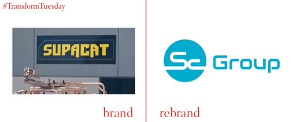
SupaCat rebrand to SC Group
Founded in 1890, engineering firm behind the RNLI’s new Shannon Class lifeboat has rebranded to be known as SC Group. While SupaCat remains the name for the internal sector dealing with established defence business, SC Group will become the umbrella term for the organisation as a whole. The branding was completed in-house.
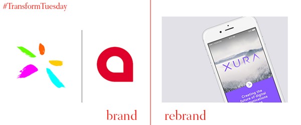
Comverse acquires Acision, rebrands to become Xura
In June, telecommunications software company Comverse acquired UK-based firm Ascision; and rebranded itself as Xura. Its new logo, which CEO Philippe Tartavull claims is a play on the word ‘Aura’, focuses on opportunities presented by operators and enterprises. Xura aim to be the next generation digital technology provider across the world; the new logo connotes mapping of thoughts and expressions, emphasising a more global brand.

