Toronto Raptors to spark ‘brand crusade’ through rebrand

Rebranding a sports team or organisation is always a risky operation. Defining a team’s character and identity requires a tricky balancing act between heritage, marketability, change management and expert design.
For the NBA’s Toronto Raptors, the team’s recent rebrand and removal of a friendly-looking dino from its logo has drawn on the organisation’s design history while embracing its role as Canada’s basketball team.
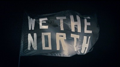
Carried out by Toronto-based agency Sid Lee, the rebrand was preceded by a video campaign called ‘We the North’ (see video below) that ran last year. The videos promote Canadian basketball and reinforce Toronto’s role as the only NBA team outside of the U.S.
Tom Koukodimos, executive creative director at Sid Lee told the Globe and Mail, “We were asked to redefine a brand, but also the city and place we’re born and raised in, so it was close to home for us. What we kept talking about was an unapologetic Canadian story. We’re always trying to define ourselves as Canadians, and we said ‘Enough of that, let’s just demonstrate what we feel. Let’s create something we look at and all nod our heads to.’”
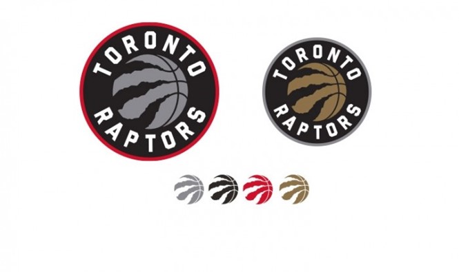
The We the North campaign and attitude has been embraced by fans thus far. The team has also put a question to the Raptors’ community – What colours should be the primary team identifiers? The new logo itself, a representation of a raptor’s claws having ripped into a basketball, replaces the running raptor of old. Yet, the colour conundrum leaves a bit of the team’s identity undefined.
Sid Lee says the campaign is intended to spark a ‘brand crusade’ among fans.
Canadian newspapers have reported dissatisfaction from brand ambassador Drake and criticism from marketing experts. The new brand will be put in place for the 2015-’16 season.

