Spotlight on MEC
Founded in 1971 as a mountaineering and sporting equipment company, but with 71% of customers now living in cities, it was time for the Mountain Equipment Co-op to change. Emily Andrews reports on the newly-minted MEC
The rebranding of Canadian retailer, Mountain Equipment Co-op (MEC), was initially the source of some controversy, particularly among the brand’s loyal advocates. However, MEC, which hadn’t previously rebranded since its launch in Vancouver in 1971, was in need of a change – it wasn’t generating enough sales, even among its own members and its brand was becoming more and more disconnected from the products it was selling.
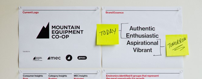
The sports equipment and clothing retailer began life as a co- operative and had since evolved into a major national retailer. Because the companyspecialised in good quality, long-lasting products for outdoor use, even loyal customers had little need to return to the retailer on a regular basis. MEC needed to diversify and reach beyond its traditional audience by shedding some aspects of its former brand. However, losing those brand elements, particularly the iconic mountain in its logo, was bound to be unpopular with some of the company’s long-term advocates.
The company’s long-standing mission is to sell hard-to-find rock climbing equipment to outdoor enthusiasts, but today 71% of its members live in urban centres. The co-op’s audience has fundamentally changed and the brand needed to reflect that. In 2013, MEC brought in Toronto-based brand agency, Concrete, to help it create a new brand that would change MEC’s reputation as a bit of a ‘dad’s brand,’ and reposition it as a young and relevant provider of sports equipment, that would stand out in a competitive environment and increase its share of the market.
John Pylypczak, president at Concrete says, “What we felt, and what the research backed up, was that the public perceived MEC, very narrowly, as a place to go if you’re into extreme outdoor activity; if you are a mountain climber, if you are going camping, if you are sending your kid off to camp and need a paddle, or something like that. The product range has all that, but it has broadened into running, cycling and even yoga, and the brand wasn’t perceived to be the place to go for that sort of thing.” These observations were backed up by buying patterns; which showed an increase in sales of gear for more urban-based sports, such as yoga and cycling, and extensive research carried out by MEC and Minneapolis- based brand consultancy, Roundpeg, who used a wide range of methods; including the analyses of social data and face-to-face workshops, to get a clear picture of both MEC’s customers and the broader market of sports retailers.
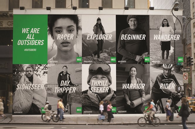
The research found that, while Canada’s younger generations tend to prefer urban-based exercises and activities over the rural experiences favoured by older generations, their appreciation of the outdoors is just as passionate. It was this truth that inspired the new direction of the MEC brand. A new brand philosophy was coined: ‘We are all outsiders.’ This proposition discourages the perception of MEC as an exclusive club and makes the brand more welcoming and approachable.
Pylypczak says of the new brand positioning, “It spoke to the commonality of the purpose; we all have different reasons and motivations for getting into the outdoors, and different ways of doing it, but we all have this common purpose in that we lovethe outdoors.” He adds that the positioning has a uniquely Canadian element since the nation is one of the most ethnically diverse in the world; the brand proposition celebrates difference, yet also a common purpose or shared ideals. The brand essence had such resonance to MEC that it was turned into the externally-facing launch campaign which included marketing and advertising collateral. Communications surrounding the launch of the newbrand were carefully orchestrated so that the evolution of the brand, rather than the design, took centre stage in both internal and external communications. Dianne Semark, design lead at MEC, says, “Internally, with staff across the country, we communicated the case for change — the vision for the future and why. It was then easier to rationalise the change in design as it linked back to the changes in business.” Insights from the research were shared with employees via regular blog posts and a dedicated project manager worked with a team of brand champions, representing each department in head office, for the duration of the project.
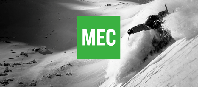
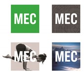
Externally, the most controversial aspect of the new brand did prove to be the loss of the mountain symbol in the old MEC logo. MEC decided to downplay the mountaineering association in the logo since it deemed this to be essential for broadening the brand’s appeal. Pylypczak says that MEC immediately gravitated towards the square logo designs, “We went into this fully expecting to redesign the mountain, to make a cooler mountain. But we came up with an alternative approach; to strip down everything and kill the mountain. It had a contemporary feel to it, it provided a blank canvas for us to work on, but at the same time it had this utilitarian feel to it, which is part of the MEC ethos.” The logo allows for the incorporation of images, videos, and portraits, while remaining instantly recognisable. The new name, says Pylypczak, was an easy choice. People tended to call Mountain Equipment Co-op ‘MEC’ anyway, so it made sense to shorten it to that acronym. The new design also made application across products a far simpler process, since the previous logo and wordmark were quite intricate. Though Concrete did experiment with different logo colours for different applications, MEC chose to maintain its original green as the predominant colour used by the brand, thus acknowledging its brand legacy. MEC is technically still a co-op, since you have to pay a five dollar fee to make a purchase, and its members may feel a particularly strong connection to the brand because of that.
Some lamented that they weren’t consulted on the new direction of the brand and turned to the MEC blog and Facebook page to voice their discontent. Pylypczak says, “The first few weeks MEC took a huge, very negative hit on social media, which they handled beautifully because they were prepared for it. They knew that the hard core constituency, the old-guard, wouldn’t like the fact that we got rid of their mountain.
“We went into this fully expecting to redesign the mountain, to make a cooler mountain. But we came up with an alternative approach; to strip down everything and kill the mountain”
The way that the new MEC brand was implemented likely contributed to the negative feedback from some of its members. While MEC wanted to focus on the entirety of the new brand, the manufacturing cycles meant that branded products hit the shelves in June before the brand was fully launched in September, which meant that the logo was inevitably viewed in isolation. Transparency in the form of a blog post from MEC’s CEO, accompanied by a video, aimed to counteract this problem by providing context for the new design. MEC also ran a social media competition called ‘Outside Moves Me,’ which asked the public to send in photos and stories that illustrated their motivation for getting outdoors. One winner received an arctic camping trip, while four more were featured in the September launch campaign. The contest, which received over 1,500 submissions, engaged people in the new brand before the major reveal. Media coverage following the rebrand was mostly balanced; while the logo did get a lot of attention, MEC’s key messages, with regards to the brand’s motivations and future, came through.
Some negative feedback was, to an extent, unavoidable. Pylypczak says, “When you’re fiddling with a brand, you don’t want to alienate the core, but in this case I think it was just a small and very vocal core. What we were doing still had meaning to them, although they perhaps couldn’t see it at first. I also think that, generally, people are to change.” Online forums and social easier than ever for the public to have their opinions heard. While this gives very resistant media make it brands valuable feedback, it also means that negative comments are instantly heard and rapidly shared, whereas before, public opinion was mostly heard in the media and through direct correspondence with the organisation in question. MEC found that preparation and a well thought-out social strategy, backed up by transparency helped it to cope with this pressure.
After the official launch in September 2013, all of the MEC stores were gradually rebranded to reflect the new visual identity and brand purpose. The new stores display photographs that illustrate far more urban activities and sports, and a more diverse cross- section of the public is represented. MEC CEO, David Labistour, says, “If we want to inspire people to have an active lifestyle, we have to ensure we remain relevant to the new generation of younger people, [and different] cultures.” Areas inside the store are now labelled according to motivation, as opposed to the outdoor sport categories on the previous signage. For example, aisles displaying cycling equipment are organised according to ‘beginner,’ ‘day tripper’ and ‘rider,’ rather than ‘cycling.’ Labistour says, “We really believe that the greatest contribution we can make to Canadian society is to actually get people active. We can’t say there is one way to do it. We have to encourage everyone to do it their own way and through their own motivations.”
MEC has also updated its online offering with a new website that features the brand’s compelling new language and imagery. The improved online buying experience is a reflection of the changing needs of MEC members, who are buying online at a rapidly growing rate.
The MEC rebrand is a reflection of the way that Canadian lifestyle has changed, particularly the way that people take part in sports and outdoor activities. Although there was some resistance from its members, the co-op has since seen positive business results, including an 8% increase in sales year-on-year and a greater than 20% increase in online sales during the holiday season (following the rebrand launch in September) as well as improved brand health metrics.
Peer review
James Packer, creative director, Industry
Repositioning a brand is challenging and it can often be done at the expense of a brands heritage. the Mountain Equipment Co-op has taken on that challenge and got the balance about right. Dropping the mountain symbol and replacing the name with a three letter acronym and indistinctive green square was bold. Perhaps they missed a trick in not creating a more emotive and memorable name of the likes of Wolfskin, north Face or Patagonia?
However, MEC is a good example of the brand being much more than a logo. Without context, you would struggle to associate it with any market or sector, but so what? this is a logo that will always be seen in context on a jacket, a rucksack or in advertising, so the logo has only one job to do: create recall. and it does this well through its simplicity.
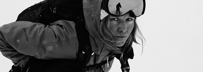
the excellent strapline, ‘We are all outsiders,’ captures the spirit of the co- op’s history while opening it up to a much broader audience. this, with the black and white portrait photography, captures the grit and determination of the MEC customer in whatever pursuit they are following.
But will the hiking and backcountry enthusiast drop the brand for a more specialist retailer as it becomes associated with lycra shorts and gym shoes? only time will tell.