Shifting brand architecture
Chemicals and pharmaceutical company, Merck, is repositioning itself as a global science and technology company.
It has also simplified its brand architecture, outside of the US and Canada; the company will now be known, uniformly, as Merck. Two previously independent brands, Merck Serono and Merck Millipore, will be absorbed. The rebranding project was executed by brand agency, FutureBrand.
Merck holds the rights to its name in every country but the US and Canada, where it will continue to be known as EMD Serono in the biopharmaceutical business, EMD Performance Materials in the high-tech materials business and EMD Millipore in the life science business, at least until the planned acquisition of Sigma-Aldrich has been completed.
Karl-Ludwig Kley, chairman of the executive board and CEO, says, "Merck has fundamentally changed over the past ten years. We have developed from a classic supplier of pharmaceuticals and chemicals into a global technology company. The complete overhaul of our brand identity is to communicate this new direction vis-à-vis our customers, partners and applicants. We want to be recognizable and remain visible as Merck worldwide so as to strengthen our well-known brand name. For this we have deliberately rid ourselves of outdated features and will be focusing on a young and eye-catching image."
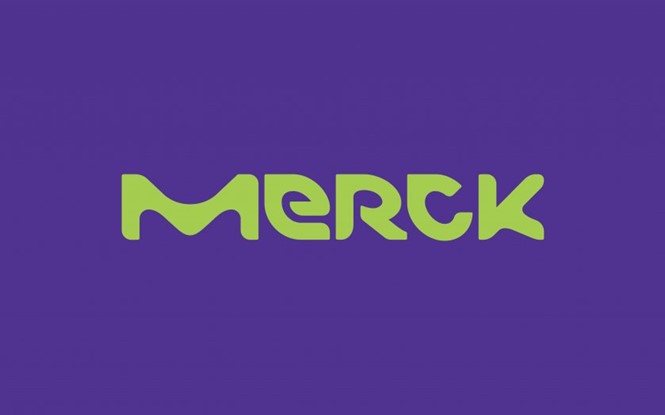
The vibrant, new visual identity is inspired by the types of shapes that might be seen under a microscope. The expressive colours and shapes, therefore, also have a scientific feel. The new logo is bolder and less complex than its predecessor, it has more of the fun and bold visual cues favoured by tech companies, removing itself from the more corporate tropes that prevail in pharma.
Walter Huber, head of group communications, says, "A comprehensive external and internal analysis showed that we must emotionalize our brand appearance to a much greater extent in order to be perceived as a vibrant technology company in the market and by applicants."
The new corporate design is also intended to create a strong visual link to the US and Canada businesses still operating under separate names. An 'M' design accompanies the full Merck logo in the new visual identity, and can be applied across any business in the Group, regardless of whether it holds the Merck name or not.

