Not what the future used to be
Post-recession, bank brands are in a period of transition. Many are trying to account for their past discrepancies while preparing for a future wholly different from that which they had envisioned. David Benady reports
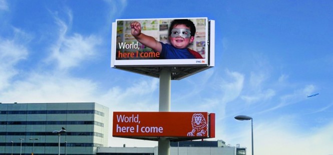
“World, here I come” is the latest advertising slogan used by Dutch bank ING as it emerges from the dark days of the 2008 banking crash and seeks to transform perceptions of its values and ambitions.
ING has plastered Amsterdam’s Schiphol airport with posters featuring variations on the theme such as: “Madrid, Here I come,” “Uncharted territory, Here I come” and “Mum’s cooking, Here I come.”
Attempts to cast ING in a more optimistic, helpful light reflect a wider move by financial brands to repair their battered reputations in the aftermath of the financial crisis.
Like many of the world’s biggest banks, ING faced collapse during the crash. It was forced to accept a $10bn state bailout and divest all its non-banking activities such as insurance and car leasing. Now, with new chief executive Ralph Hamers at the helm and a turn-around strategy called Think Forward, ING is looking to transform people’s understanding of what banks are for.
“The campaign is about people doing what is important for them, but with us helping and facilitating and empowering them,” says Nanne Bos, ING’s head of global brand management.
Where previously banks made bold, hubristic statements about the benefits of size and how they could make people richer, today they are redefining themselves as enablers, supporting people’s choices. “You won’t see anything about us in the campaign, we are not saying how global we are, how many markets we are in nor what you should do with your money,” says Bos. Instead, the campaign, created by agency United State of Fans/TBWA, seeks to show how banks can give people confidence, “To pursue their ambitions however big or small,” according to Bos.
Bos is overseeing a wider rebranding exercise for ING, after chief executive Hamers’ identified the brand as one of the bank’s most valuable assets. Persuading staff and senior managers to buy into the brand positioning has been a vital part of the task. “It took some time to get people to open up their minds to the future rather than being stuck in their own context and business units. What are you part of, the business unit or the bigger story going forward?” says Bos.
ING also has to overcome public scepticism about banks. “Changing branding and visual identity or advertising are nice to do, but if you look at the fundamental scepticism of consumers, you have to do a lot more. Take little steps and remain humble in how you present yourself,” is Bos’s advice to other banks.
But there is a thin line between humility and appearing apologetic. Striking the right note in relaunch advertising and brand campaigns requires great sensitivity. RBS and its NatWest subsidiary – which received a £46bn state bailout in the UK and are still Government-controlled – relaunched using the advertising line, “Goodbye unfair banking, hello NatWest” (“hello RBS” in Scotland). Did this serve as an apology for their own poor showing or was it an acknowledgement that the whole banking system was unfair? Was it too apologetic or did it show the right level of humility?
Lloyds spun off its TSB division into a separate bank using the slogan, “Welcome back to local banking,” But some wonder whether the bank has done too little to acknowledge its own failings and contribution to the crisis.
Banks across Europe and the US are facing similarly tough questions as they pursue relaunch strategies. New banking regulations are in place to try and ensure that there is no repeat of the crisis. The institutions insist they have cleaned up their acts and many have paid a high price, not just in fines. Barclays closed down its wealth management arm – worth £1bn a year in profits – after incoming chief executive Antony Jenkins put ethics before profit and judged that the division was little more than a tax dodging operation.
“It took some time to get people to open up their minds to the future rather than being stuck in their own context and business units. What are you part of, the business unit or the bigger story going forward?”
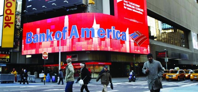
As 2008 recedes into memory, attempts are emerging to make banking seem nicer, more human-scale and less greed-driven. But there are constant reminders about the misdemeanours of the sector with fresh scandals still ongoing. The name HSBC regularly crops up in scandals while Barclays has been at the centre of repeated misconduct allegations. In 2014, six years after the crash, memories of that dark era were stirred up again when Bank of America (BofA) was handed the biggest ever corporate fine – nearly $17bn – for the misdemeanours of the two financial brands that it bought during the crisis, Countrywide Financial and Merrill Lynch.
Bank of America stepped in to buy Merrill Lynch at the height of the crisis as the brokerage faced collapse. It was a controversial deal as BofA paid $50bn and some argue that price tag could have been lower had it waited just a few days longer. The US government bailed out BofA with $20bn to pay for Merrill Lynch’s losses.
Thus, the task of creating a set of coherent messages about the unified Bank of America and Merrill Lynch after the acquisition was a significant challenge.
Branding agency Brand Union worked on the relaunch, moving the brand away from the aggressive and muscular image it had espoused in the past and attempting to give it a softer and more socially-constructive feel.
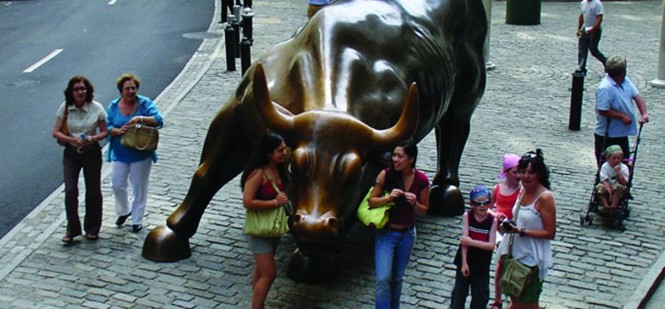
Merrill Lynch’s iconic bull logo was the first thing to go. The bull statue was introduced in 1974, but was felt to be an overly aggressive symbol for a new era in which banks are trying to avoid appearing hard-edged and greedy. The symbol was phased out, though still appears in some of Merrill Lynch’s divisions, such as the wealth management arm Merrill Edge.
Veb Anand executive director of strategy for Brand Union New York, says that in 2013, the agency helped BofA put in place an integration of the entire enterprise, repositioning it “For the human era.” Rather than focusing on growth and the opportunities in risk-taking, the bank adopted a new narrative about connectedness, using the line, “Life is better when we are connected.” The rebrand included a new brand identity for the three divisions of wealth management, corporate and global. There was a global product campaign and an employee engagement plan.
“Banks had been large edifices using powerful, hard- edged symbols, scale, stability and their global footprint. In the US, all of that had to suddenly change, they didn’t have the credibility to position themselves like that,” says Anand. “Everyone wanted more humanity and transparency, putting on a more human face because people didn’t understand what banks did to make so much money. The banks have tried to make it seem like something more tangible, the narratives became more about explainsing to people.”