Not just tech
The technology sector has changed from something that was quite grey and inaccessible to something that is now an inseparable aspect of everyday life, particularly among the younger generations.
This is reflected in the visual identities of the world’s leading tech companies, which shy away from the traditional, stuffy image and embrace colour, innovation and attractive design.
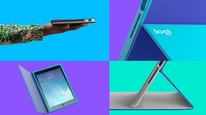
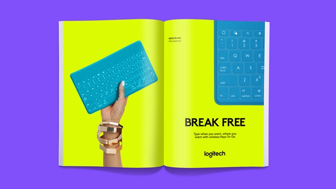
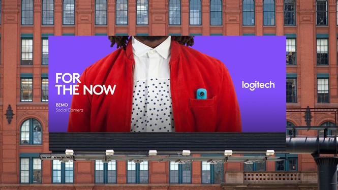
Technology retailer, Logitech, has lost its tech in a rebrand that points to the brand’s wider changes. The new visual identity, for Logitech, created by Design Studio, is intended to prepare the company for its future role as it expands its core PC product range into new territories such as mobility and the connected home. Taking the ‘tech’ out of Logitech removes a descriptor that could potentially limit the development of Logitech as the industry changes and demands different products.
However, it has been revealed that the new Logi label, and the bright, new design, which is geared towards a more youthful audience, will only appear on new and future product ranges, while Logitech’s more traditional products, such as keyboards and mice, will continue to display the old Logitech brand. Logitech’s original Brown Pro typeface also remains, in recognition of the brand’s 30-year heritage.
The new identity was inspired by internal changes in the company as well as new product development. The new brand puts design at its heart. Alastair Curtis, chief design officer at Logitech says, “Design is at the heart of everything we do moving forward. It’s the force driving the company. Now our brand truly reflects the ambition of the company.”

