‘Creative British flair’ for crab meat company’s rebrand
With an aim to target a market of more premium restaurants, the gourmet qualities of Oceanica Crab Meat’s product became the main focus of its recent rebrand.
Oceanica, a sub-brand of Miami-based Blue Star Food, appointed Nottingham-based the CLIP Group branding and design agency.
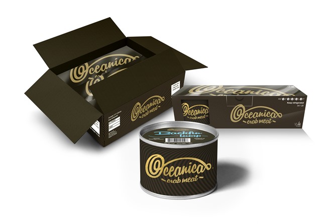
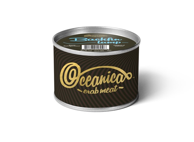
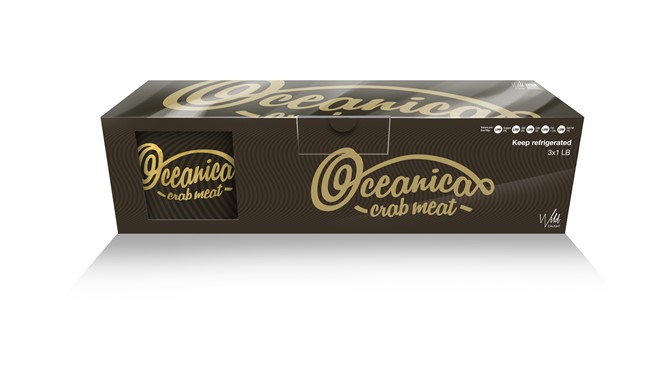
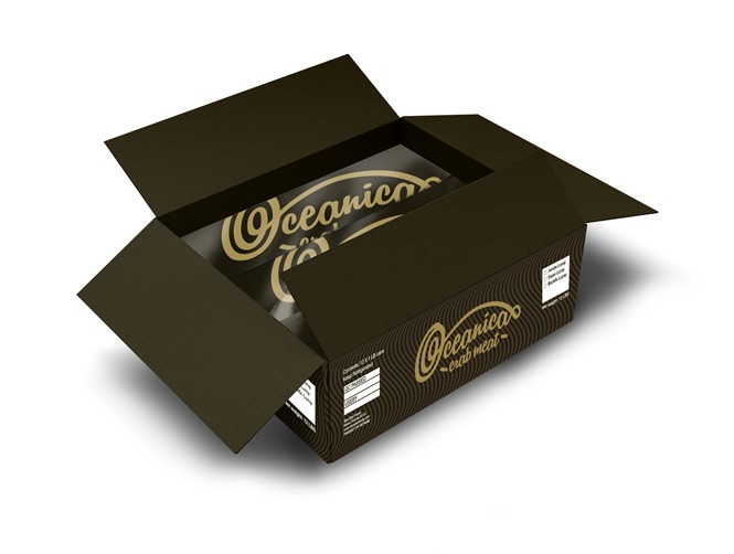
Although some brand aspects, such as the Oceanica name and packaging nets, were predetermined, somewhat limiting the creative scope of CLIP Group, current market conditions and client vision led to a re-imagining of Oceanica's packaging. Employing a simple colour scheme of gold font atop alternating brown stripes, with light blue font on the lid, the brand has a more elegant feel.
The previous Oceanica Crab Meat image was visualised through the busy, bright typeface on its product packaging. It was perhaps less sophisticated than a product designed to appeal to high-end consumer markets, where designs tend to be more sparse and pure.
Director at the CLIP Group, Anish Mistry, explains, “The client required branding and packaging for a premium product that was focused towards mainly independent restaurants. To have so much creative freedom for a foodservice product was a great opportunity for us to be pioneering. We needed to ensure the colours, typography and the feel of the brand and packaging were high end, while also ensuring that the key messages of the product were also portrayed. We had to create a visual brand with enough impact to engage with food service clients.”

