Martini discovers its heritage through new identity
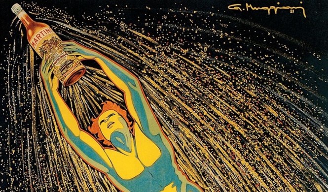
Brands in the alcoholic drinks sector often accentuate their heritage and craftsmanship, and a recent revamp by Martini sees the vermouth retailer go back to its origins.
The redesign is a simplification, reducing any shadows or highlights and leaving nothing but a flat, classic graphic. The gold thread detailing has also been removed from the product logo.
However, the Italian brand has kept its raw components. The red circle and black strip emblazoned with the Martini typeface remain largely unchanged. The visual identity has been stripped down to its bare bones.
For the Martini brand, this simplification process reflects its aspirations for honesty and lack of artifice. The new identity also harks back to a history and heritage. The new advertising borrows from the traditions of vintage French posters. Altogether, the new Martini brand positions itself as a classic, vintage brand with class and authenticity.
Emphasising heritage and craftsmanship is a popular design trends at the moment, and Pearlfisher’s new design for Jameson’s Caskmates whisky is another recent example.


