Green waste branding yields new life for TS Industrie
In 2010, major European green waste companies Tünnissen and Saelen Industrie merged to become the major player in the waste management marketplace as TS Industrie. The EU’s directives regarding the reuse and recycling of green waste have benefited TS Industrie as it is now the leader in European green waste. It sells about 10,000 wood chippers and shredders per year to distributors and direct to customers.
This brand positioning was complemented in the merge by a blocky, blue TS monogram encircled with beveled grey. The strapline, ‘Experts in mobile wood chippers & chippers/shredders’ was a bit lacking in terms of dramatic impact. In a response to increased competition, TS Industrie and Brand Brothers worked to redefine the brand and modernise its visual identity.
The company has a joint heritage dating back to 1880. But it found that heritage was not being reflected in its communications and thereby not being used as a commercial advantage.
The Brand Brothers says, “The company was facing a stiff competition and a strategy of takeovers that were weakening and diluting the corporate image among users.” To combat these changes, Brand Brothers created a new brand that would reflect the company’s core products, while providing visual impact and better-defining its brand architecture.
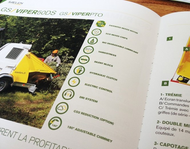
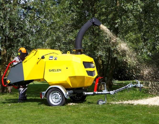
Thus Saelen was born again. A custom typeface evokes the machinery upon which TS Industrie is built. The bold yellow, black and grey identity draws from the yellow wood chippers that the company had always produced. Brand Brothers focuses the strategy around the importance of green waste management and the role TS Industrie and Saelen play in that life cycle. The materials with which the company deals inform the graphic style and communications tools that make up the new brand.
From an outdated logo that was described by TS Industrie as, “TS Industrie conveys its new development perspectives through a new logo, which asserts its position: the circle demonstrates the shredding process associated with the Patented Mixed Rotor and cutting disc technologies. It is wrapped around the letters TS: their design is reminiscent of wood chippings which creates continuity with the former and also echoes the initials of Tünnissen and Saelen. In the circle, the word Industrie, identical in German and French, conveys the identity of the manufacturer,” the lifecycle of the corporate brand reaches a new stage.


