Evolution in east London as Canary Wharf Group rebrands


“The city doesn’t belong to us,” said Sir George Iacobescu at the launch of the Canary Wharf Group’s new brand yesterday morning. He noted that it was the tenants, workers, residents and travellers that brought Canary Wharf to life. The new branding is the latest step the group has taken to unite those audiences behind a singular set of values. “We’re trying to match the movies,” he said, referring to the luxury feel the new brand projects.
Camille Waxer, chief administrative officer of the group said, “We have created a place. A place where there is a sense of belonging. We hope the new brand mark will help create Canary Wharf as a destination in which to work, play and now live.” The rebrand marks the beginning of a phase of expansion for the Canary Wharf Group plc, both on the Isle of Dogs and throughout the city. For a company that’s been working toward this kind of change for 25 plus years, brand reputation and will play an important role in the next stage of its expansion.
The Canary Wharf Group has already taken on projects in the City of London as well as the upcoming Shell Centre redevelopment of the Southbank. However, its focus will also be zeroed on the continuing development of Canary Wharf itself, largely on residential development. Property development relies, however, on trust in the brand. “People like to know that it’s a solid builder. You have to have their trust. I think we’re going to be fine,” says Waxer. “They can look at this product, whether it’s the offices, the retail or our events and know that we do things well.”
After 27 years and the establishment of Europe’s biggest financial district, Canary Wharf Group can reasonably say that it has a strong reputation. It successfully lobbied the government to advance plans for the Crossrail project by agreeing to build the Canary Wharf station. The group also built the two DLR stations on the Canary Wharf Estate and is responsible for the infrastructure, maintenance, lettings and upkeep of the estate, jobs usually tasked to local authorities. Because of success in those areas in addition to a strong relationship with tenants, the Canary Wharf Group has a solid basis upon which to build its brand.
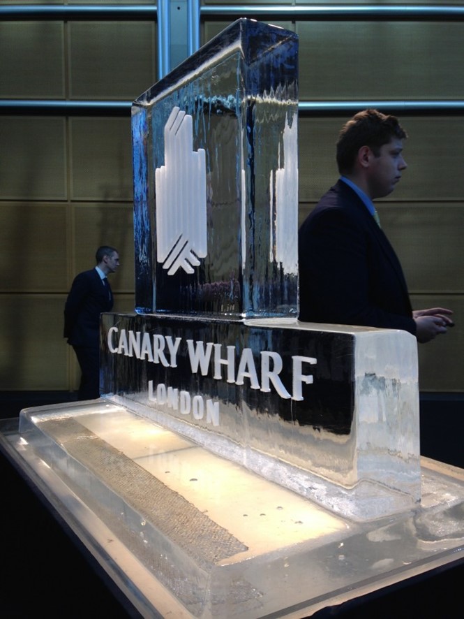
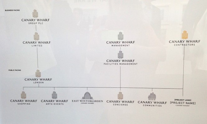
Thus, the new brand, designed by Sutton Young, reflects the values the group espouses, as well as its reputation and its growth aspirations. The logo is a reflective of the estate’s iconic towers, without fully depicting them. Sub-brands are clearly defined and, in some cases, have their own visual identities. The brand has been applied across a range of materials and assets, not an easy task for a company that owns everything from high-rise buildings to maintenance vans and concierge notepads. “We knew that the design that Mike [Sutton] came up with was the right design because it worked across all of the different companies and you didn’t have to worry about changing it or tweaking it. It just worked,” Waxer said.
Sutton, MD of Sutton Young, adds “What we’ve been trying to do is simplify. We knew we wanted to create the mark and we knew that we wanted something that people would recognise but that would, in time, become something that one would just associate with Canary Wharf.” The end result draws inspiration from the iconic towers, but does not replicate them, allowing for a sense of discovery about the brand.
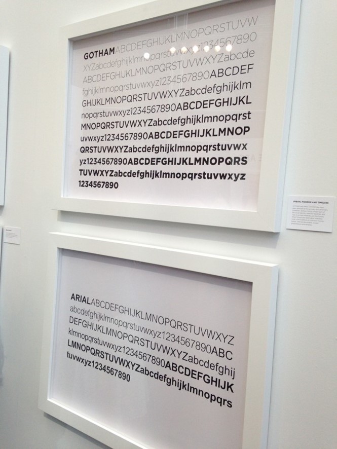
The typography and colour palette were also addressed in the rebrand. Sutton says the colour palette was fairly intuitive. Its grays, blues and burnt yellows, alongside the logo’s black and copper, invoke a sense of value and luxury. The typeface however, is a mix of custom and standard. Sutton himself developed the typeface for the words ‘Canary Wharf,’ adding a touch of quality to the mark. Gotham and Arial are used in other applications, to allow for accessibility, clarity and familiarity. “It’s modern, but it’s timeless,” said Sutton.
That’s a phrase that runs through the brand and most elements have been developed to reflect that. But it’s also an ethos that Waxer and her team have been applying to retail tenancy for some years. She said tenants in the shopping areas on the estate are those that fit within that brand attitude. She added, “We’re very involved with our tenants. A lot of large shopping malls have tenants’ associations, we don’t want that. We want a much more personalised service. If you’re waitrose your needs are very different from a shoe repair shop and that’s so key, you can’t group everyone together because it just doesn’t work.”
The new brand acts in a similar fashion. It doesn’t lump all of the varying sub-brands and products under the same catch-all identity, but it does unify them behind a corporate identity that speaks to the Canary Wharf Groups brand values.