Employees choose name for Moneypenny’s new logo
Telephone answering service, Moneypenny, has unveiled a new brand that includes a bird logo, named by employees, and a new international website.
The new brand coincides with the launch of moneypenny.com, a corporate website that reflects the business’ growth into international markets.
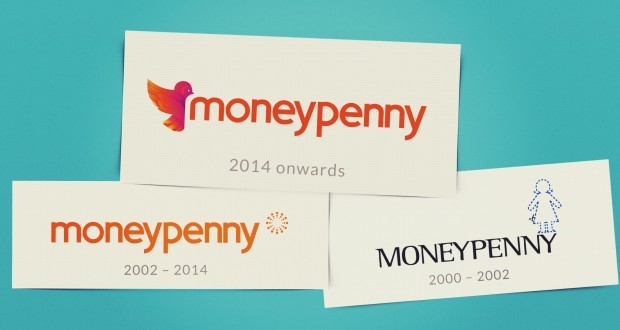
Moneypenny retains its typeface, but the dotted icon from the original logo, representing a telephone headset, has been replaced with a small bird image. This may be influenced by the changing face of technology and the shift away from the landline phone as preferred method of communication. A bird is a popular symbol for communication, while the feathering detail provides design opportunities for a consistent look and feel to the brand.
Head of creative at Moneypenny, Sally Barrett-Spring says, “These are exciting times at Moneypenny, after around 13 years with our previous logo, we decided it was time for something a bit different. We wanted to create a logo that would work across every platform – our website, online, print, exhibition stands, letterheads, email footers, videos and photography, around our offices – basically anywhere we are visible to our customers.”
Moneypenny staff were encouraged to choose a name for the bird in the company logo. The winning name, Tully, is the surname of the company’s oldest PA. While the new visual design retains the orange colour of the former brand, a new colour palette that stems from the bird icon has also been created.
“The fresh new feel is aimed at reflecting where we are now and where we are heading in the future.” Barret-Spring adds.
The new look will be rolled out at a series of events over the coming months.
Hannah Stringer, head of marketing at Moneypenny, concludes,
“It has been a resource-heavy exercise but well worth the effort; equipping us for the changing times we all now live and work in. It’s early days but feedback has been really positive.”


