Cancer Research UK brand development reflects scientific progress
Cancer Research UK has long understood the connection between brand and corporate reputation, says Carolan Davidge, communications director for the charity. Though she did not work directly on the latest brand development project, she highlights CRUK’s outlook on brand, “We are very cognizant of the importance of brand and the perception that our stakeholders have of us is everything.”
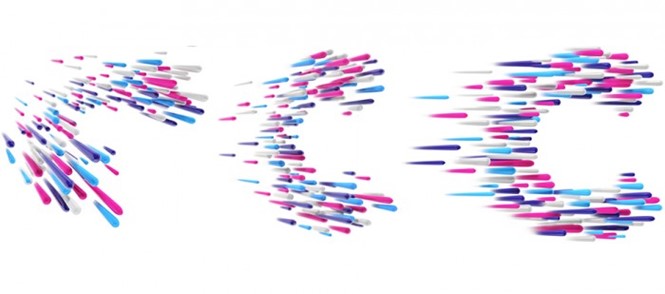
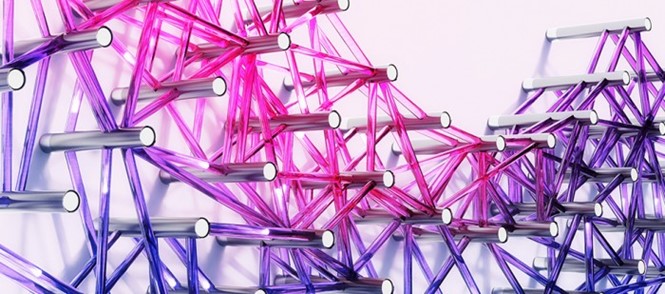
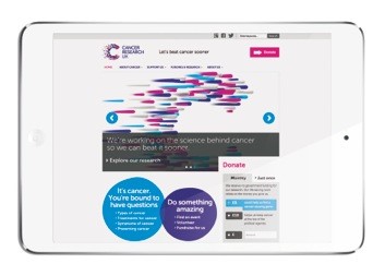
Cancer Research UK had last updated its brand in late 2012 when it transformed the former ‘arrow’ visual identity into a more vibrant, digital-friendly look that was also eye-catching on the high street. Behind that brand, however, was the new strategy of promoting the charity’s world-class scientific work and its mission to cure cancer. Recently, CRUK partnered with London-based design agency SomeOne to further develop that brand. SomeOne has taken the dots that comprise the new wordmark and introduced six new themes to reflect the theme of ‘beating cancer sooner.’
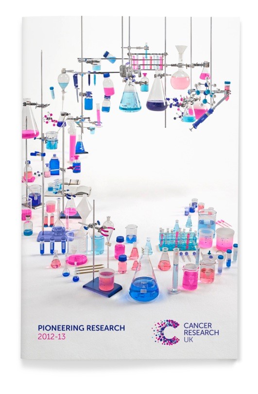
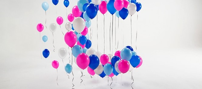
The new themes depict the different areas of the charity’s focus, like scientific research – using a ‘C’ made up of laboratory equipment, and that of celebration which uses balloons to form the now-iconic dots.
SomeOne’s creative director, Laura Hussey, says, “The designs have been created in a variety of different ways — from physical builds and photography — to 3d CGI modelling and animation. Many of the designs are accompanied by films to bring them to life further and make them as useful as possible.”
The development of the brand is not only visually appealing, but serves to support the development of the charity’s message. Now that one in two people survive cancer diagnoses, CRUK is pushing to increase that number to three in four in 20 years.
Kate Eden, head of brand at Cancer Research UK, says, “We’re delighted with this new suite of C designs. It powerfully visualises the themes that drive our mission to beat cancer sooner. Our brand assets must continue to deliver our message in relevant new ways.”


